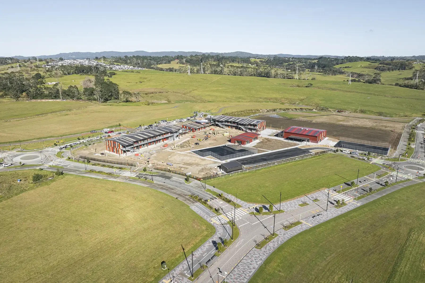
Property development
Rua Hills
A complete brand for a new NorthWest Auckland development — identity, guidelines, and the launch site built to capture registrations before Stage 1 released.

- Role
- Brand identity, guidelines, web design & build
- Year
- 2023
- Location
- NorthWest Auckland
The situation
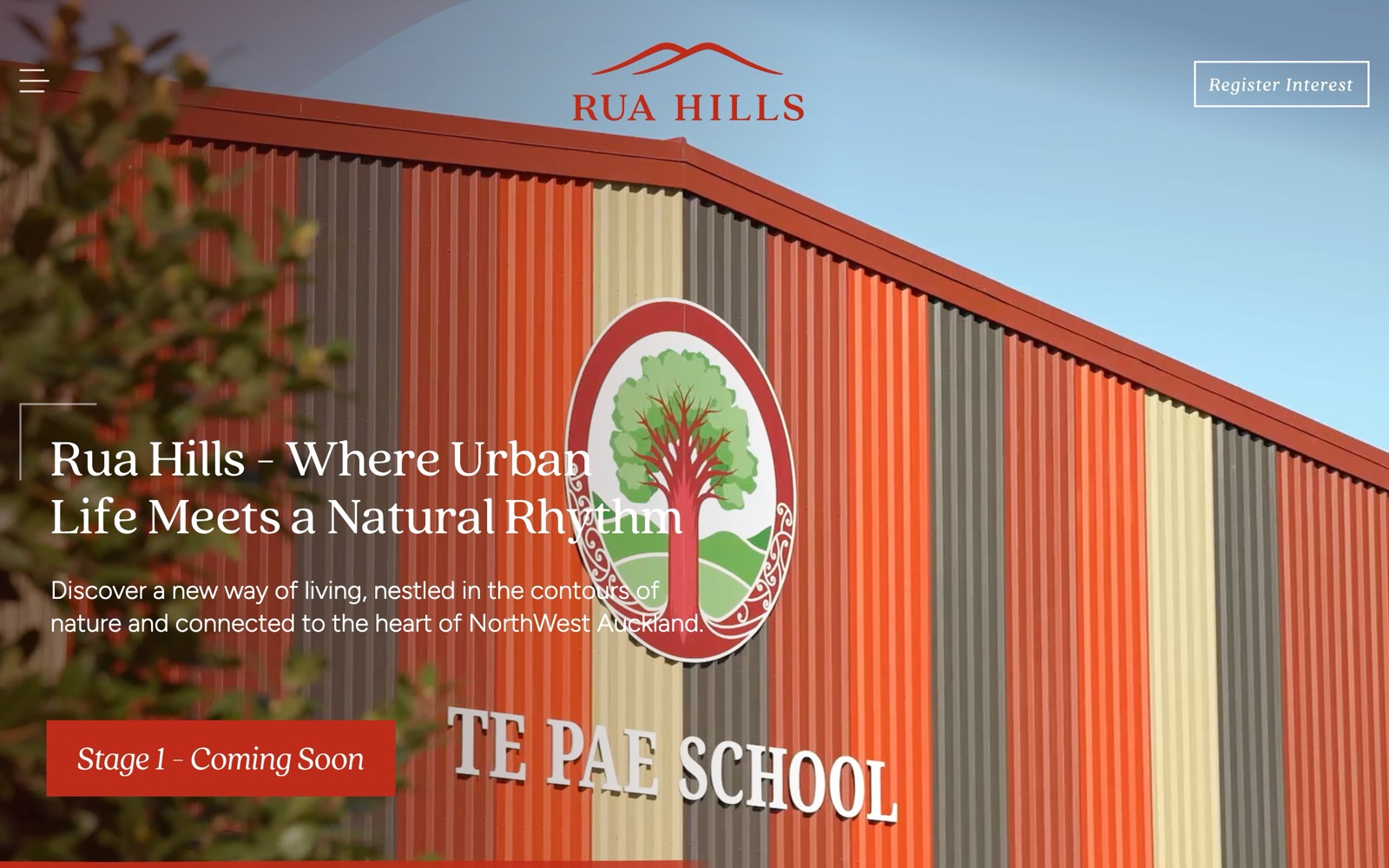
Rua Hills is a new residential development in NorthWest Auckland, and at the start it had no name in the market, no visual identity, and nothing built to photograph. The job wasn't only to sell — it was to create the brand from scratch, then use it to build a qualified interest list ahead of Stage 1 releasing.
What I did
- 01The Rua Hills brand identity, including the logo and its landform mark
- 02A full set of brand guidelines covering logo use, colour, typography and tone
- 03A palette drawn from the site itself — clay red against the greens of the land
- 04A type system pairing a warm serif for character with a clean sans for clarity
- 05The launch site, designed and built around a single goal: register interest
- 06Clear staging communication so prospects understand what's available and when
- 07A design that carries the natural setting rather than defaulting to generic property CGI
A closer look
The parts worth showing.
Interactive lot map
A site plan buyers can actually explore
The centrepiece of the sales tool: an interactive map of the release where every lot is clickable. Selecting a lot animates smoothly to it and opens its detail — status, area, price, and its own site plan — so a buyer can browse availability directly on the plan instead of cross-referencing a PDF price list. Availability, sold and on-hold states are colour-coded and read at a glance, and a list view covers anyone who'd rather scan than explore.
Interactive lot map
A site plan buyers can actually explore
The centrepiece of the sales tool: an interactive map of the release where every lot is clickable. Selecting a lot animates smoothly to it and opens its detail — status, area, price, and its own site plan — so a buyer can browse availability directly on the plan instead of cross-referencing a PDF price list. Availability, sold and on-hold states are colour-coded and read at a glance, and a list view covers anyone who'd rather scan than explore.
Positioning
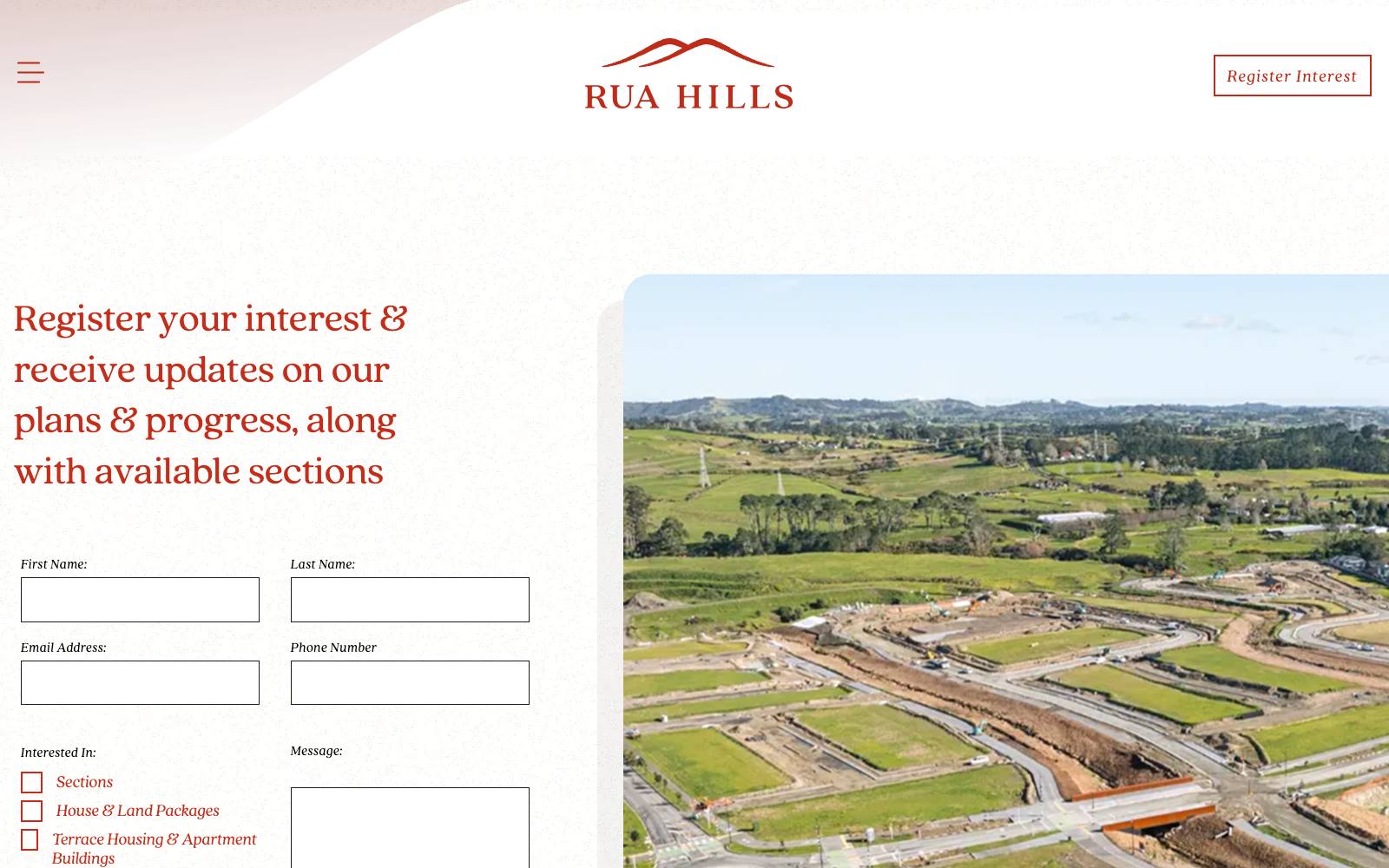
Lifestyle framing before there was product to photograph
At launch there were no finished homes to show. The 'Life at Rua Hills' content established what living there would feel like — walkable neighbourhoods, green space, the natural contours of the land — so the development had a character long before Stage 1 released.
Credibility
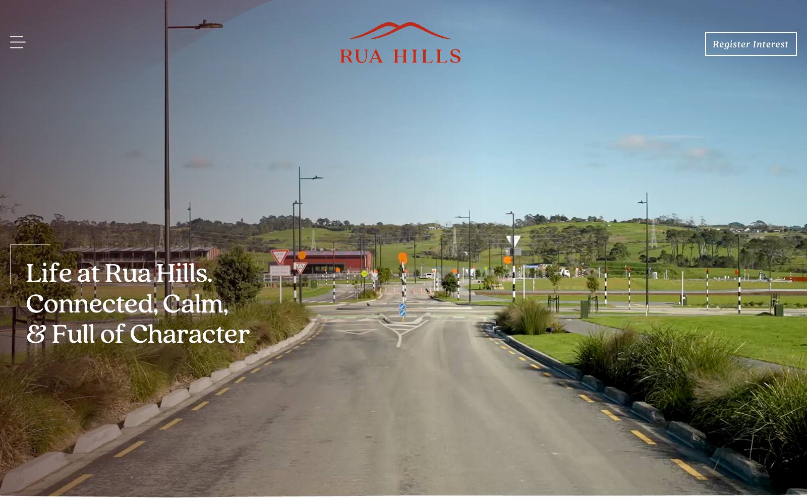
The developer's history doing the trust work
Buying off the plan is an act of faith in the developer. Surfacing Hugh Green Group's history and the land's own story gives a prospect grounds for that confidence at exactly the point they're weighing a deposit.
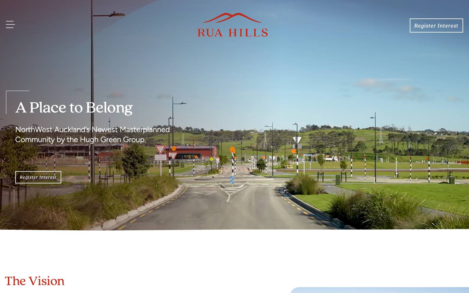
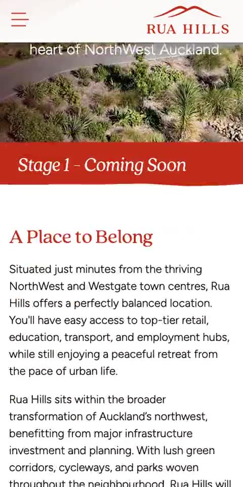
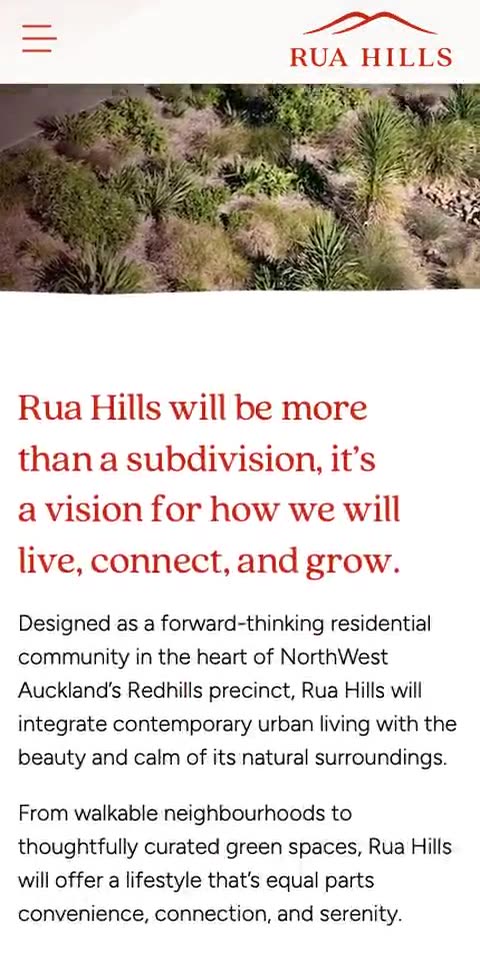
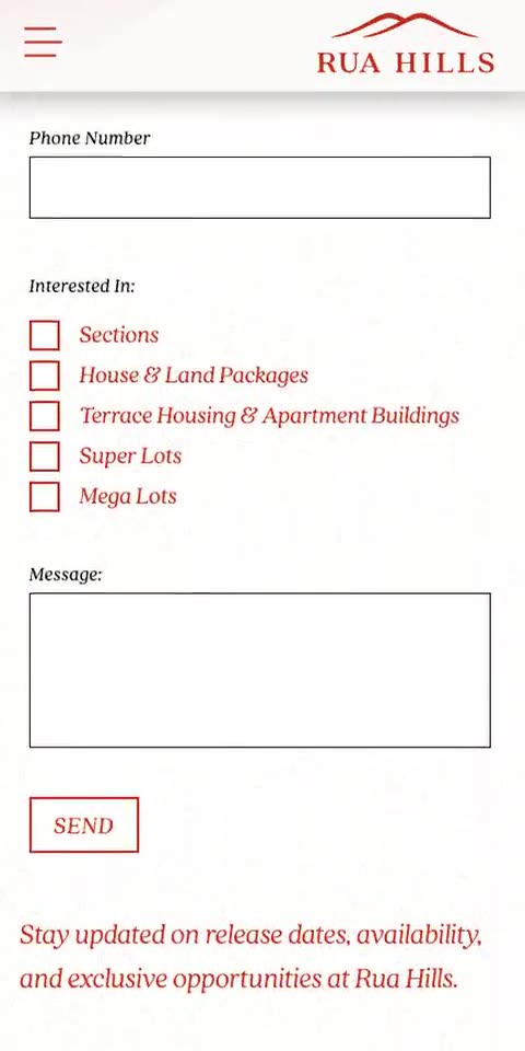
On a phone
Where most of the traffic actually is.
How it went
From first conversation to live.
- 01
Discovery
Launch-phase property is an unusual brief: there's very little to photograph and nothing yet to sell, but the marketing has to start. We agreed the site had exactly one job — capture qualified registrations — and that every other consideration was subordinate to it.
- 02
Look & feel
Most new-development sites default to the same glossy CGI and stock families. Rua Hills had a genuine differentiator in its setting — contoured land on the edge of NorthWest Auckland — so the direction leaned on the landscape and the idea of urban life against a natural rhythm, rather than renders of houses that didn't exist yet.
- 03
Build
Everything routes to registering interest, with prompts placed persistently but never at the cost of the story. Staging is communicated explicitly, so prospects understand what's available now versus later — managing expectation is most of the trust in a staged release.
- 04
Launch
Launched ahead of Stage 1 to begin building the interest list before release.
- 05
Support
Structured so it can grow into a full sales site as stages release and there's real product to show.
The result
A brand and a launch presence delivered together, so the development had a coherent identity — mark, palette, type and voice — before a single home was built.
Notable
- Logo mark abstracts the contoured landform the development sits on
- Clay red (#BF2B18) as the primary, drawn from the region's soil
- Quincy CF paired with Figtree — warm serif character, clean sans clarity
- Guidelines written so a third party can apply the brand without drift
- Single-goal site: every path leads to registering interest
- Built to extend into a full sales site as stages release
Delivered through a New Zealand agency
Let's see what your website could be.
Tell me a bit about your business and I'll show you what's possible — no obligation.
Prefer email? sam@digitalhouse.nz