
Product · family wellbeing
MoodSpace
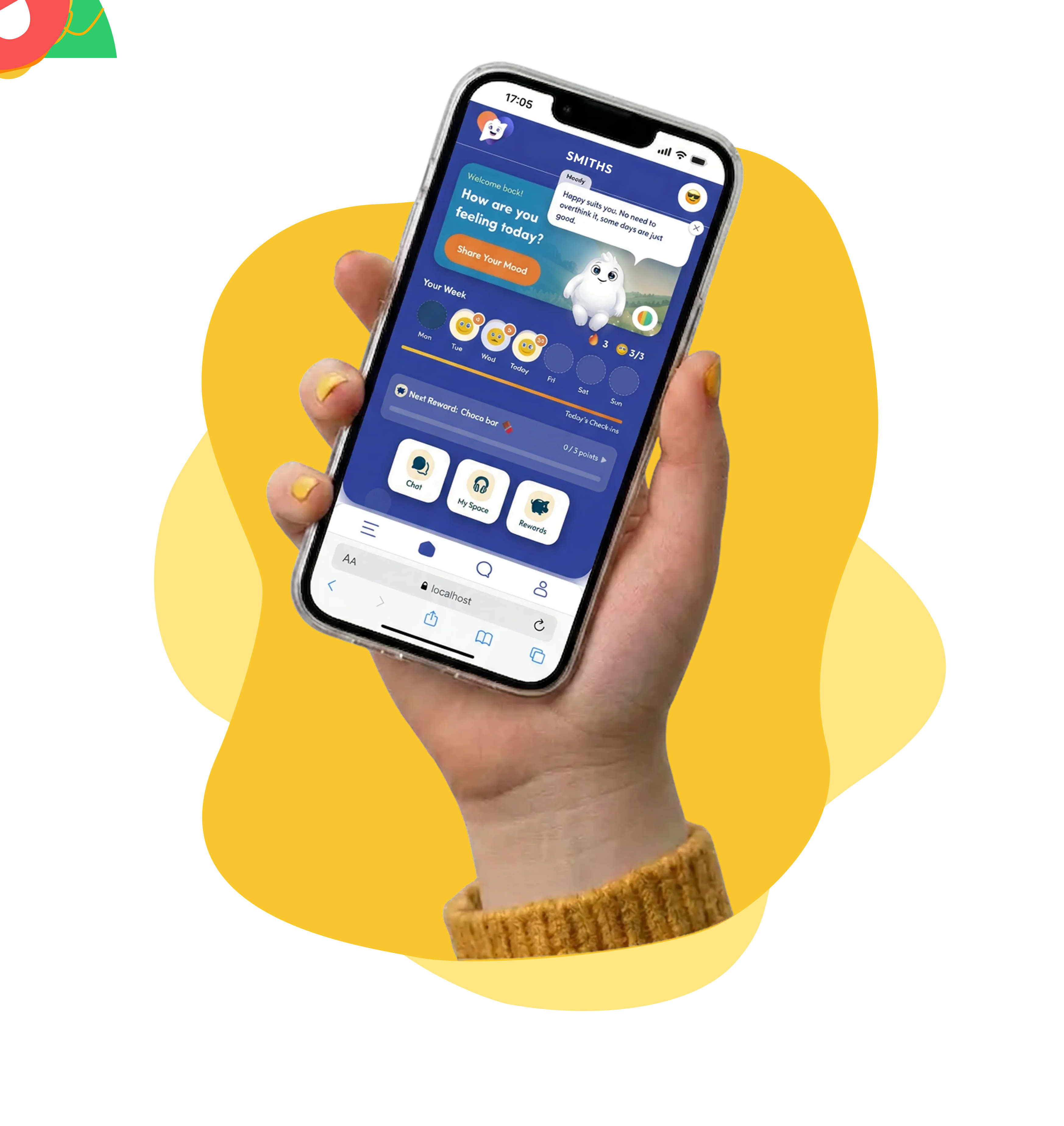
My own product — a family wellbeing app that gives kids a quick way to check in and parents a window into how they're really doing. Designed and built end to end, web and Android.
- Role
- Product design, web build & Android app
- Year
- 2025
- Location
- New Zealand
The situation
Kids get a phone years before they get the words for how they feel, and parents lose visibility exactly when it starts to matter — at school, at practice, out with friends. Most wellbeing apps answer that with journals and questionnaires, which is precisely what a twelve-year-old will not do. The design problem was making the check-in take seconds and feel like something a child would actually want to open.
What I did
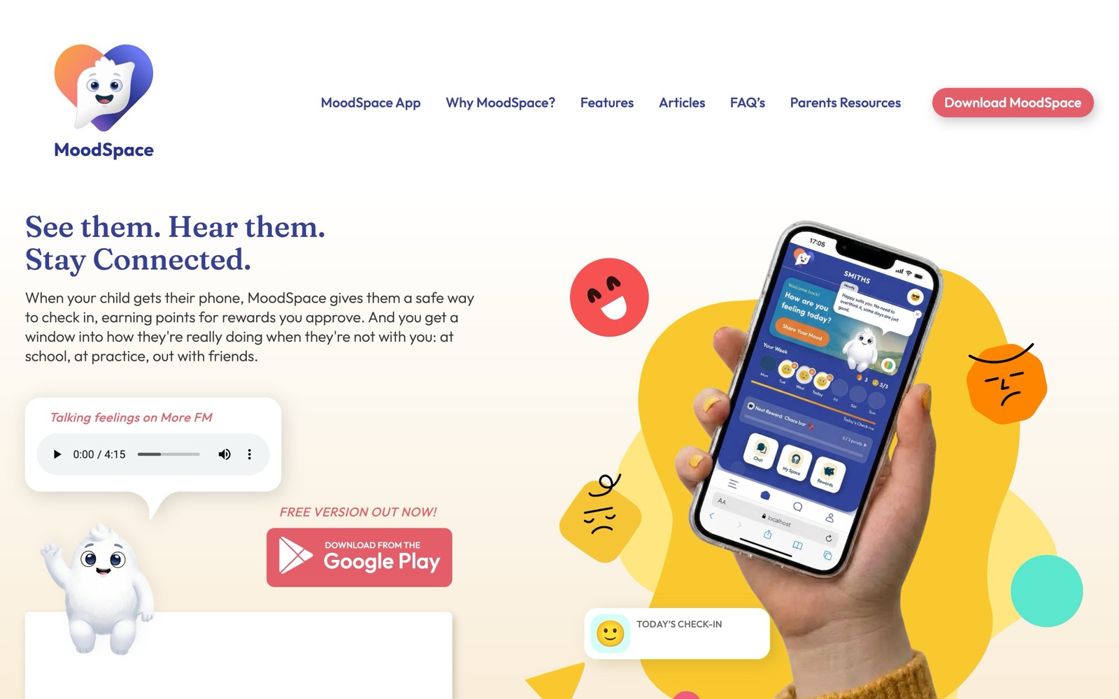
- 01A daily mood check-in built around tapping, not typing — the whole interaction takes seconds
- 02A points and rewards loop where check-ins and chores earn points parents approve and redeem
- 03A private parent–child chat, so there's a line open between face-to-face conversations
- 04MoodBuddy, a companion character who greets the child and celebrates streaks
- 05A Calm Corner with guided breathing for when feelings get big
- 06A parent insights dashboard showing mood trends and gentle pattern alerts
- 07The marketing site, the brand, and the Play Store listing
A closer look
The parts worth showing.
The product
A mood tracker a family can actually keep up with
Logging a mood had to take seconds, or nobody sustains it past the first week. The check-in is reduced to a single deliberate action, with the history and patterns kept one layer back — visible when a parent wants them, out of the way when they don't.
The product
A mood tracker a family can actually keep up with
Logging a mood had to take seconds, or nobody sustains it past the first week. The check-in is reduced to a single deliberate action, with the history and patterns kept one layer back — visible when a parent wants them, out of the way when they don't.
Two products, one system
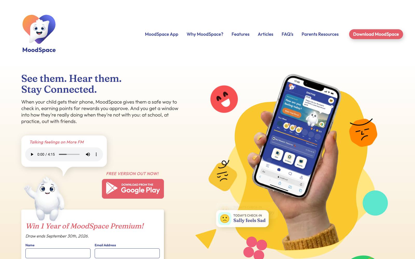
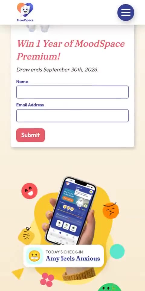
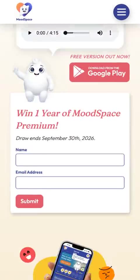
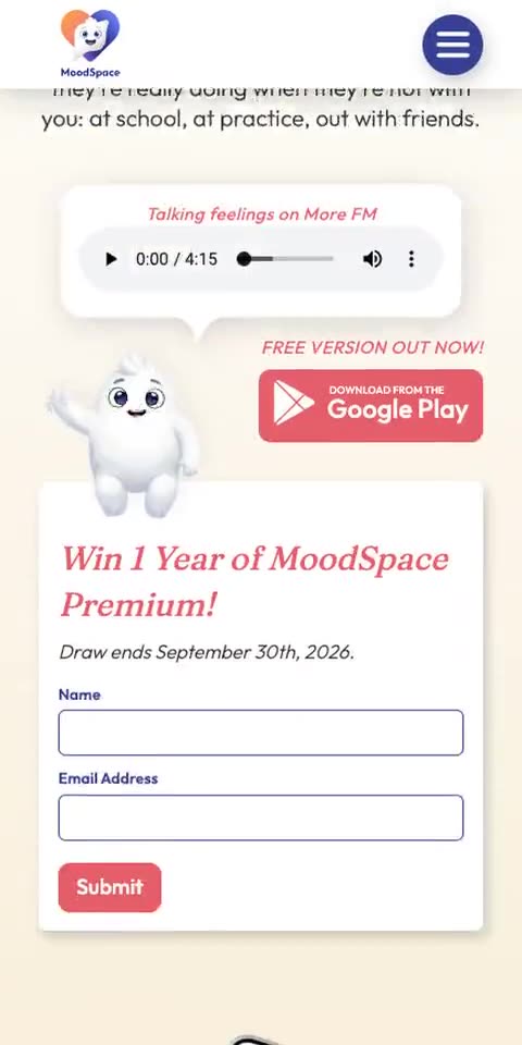
The site and the Android app share a design language
The marketing site and the app were designed together rather than one being retrofitted to the other, so a visitor who downloads the app finds exactly what the site promised. Same type, same palette, same tone.
On a phone
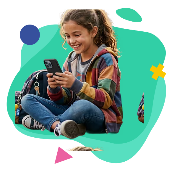
Where most of the traffic actually is.
How it went
From first conversation to live.
- 01
The idea
MoodSpace started from a problem I kept hearing from parents: the phone is always in their kid's hand, but it's a wall rather than a window. I wanted to test whether the same device could be the thing that opens the conversation instead of closing it.
- 02
Designing for a child, not a user
The central constraint was that a child will abandon anything that feels like homework. That killed free-text journalling early. The check-in became a single tap on a face, and every subsequent decision followed from it: no typing, no streak-shaming, and points awarded for showing up regardless of which mood was picked — because a bad day still deserves credit for being shared.
- 03
The no-AI decision
It would have been faster to generate MoodBuddy's encouragement with a language model. I decided against it. Every message a child sees is pre-written and reviewed by a person, and the app says so plainly. When you're building for children and asking parents to trust you with how their kid is feeling, an unpredictable generator is the wrong tool at any price.
- 04
Build
I built the Android app, the marketing site and the brand myself. Being both designer and developer meant the reward economy could be tuned against the real interface rather than a spec — points values, streak logic and the parent approval flow all changed once they could be used rather than described.
- 05
Launch & after
MoodSpace shipped to Google Play with a free version, an age-appropriate 3+ rating, and a marketing site written for parents rather than for app-store algorithms. It's an ongoing product, not a delivered project — which is a useful thing for a client to know about how I work.
The result
A live product on Google Play, rated 3+, with the whole stack — brand, marketing site, app and store presence — designed and built by one person.
Notable
- Native Android app, published on Google Play
- Marketing site, brand identity and store listing all in-house
- No AI in the child-facing copy — every MoodBuddy message is written and reviewed by a human
- Designed for a 3+ content rating, which constrains every interaction
- Points economy tuned so a check-in always rewards, whatever mood is chosen
Let's see what your website could be.
Tell me a bit about your business and I'll show you what's possible — no obligation.
Prefer email? sam@digitalhouse.nz